You know when you walk into a room and something just clicks? Often it’s colour doing the work. A well-chosen tile can shift the entire mood of a space; and blue, more than most, has a way of making rooms feel considered without being overdone. It’s one of those design choices that looks deliberate without requiring much effort, which is rarer than it sounds.
I remember visiting a friend’s house where the kitchen had a run of small, light blue tiles as a backsplash. Nothing elaborate — just a clean strip of colour behind the hob. But it made the whole room feel brighter and more alive. We sat there for hours over coffee, and those tiles kept drawing the eye without demanding attention.
That’s the thing about blue done well: it gives a room somewhere to land.
Why Blue?
Blue is one of the few colours that works across almost every interior register: coastal and calm, graphic and bold, heritage and contemporary. It carries associations with sky and water that feel instinctively restful, which is part of why it’s never really gone out of fashion. Trends cycle through terracotta, sage, dusty pink; blue outlasts all of them.
There’s also a psychological dimension worth considering. Studies on colour and environment consistently show that blue spaces are perceived as calmer and more spacious than equivalent rooms in warmer tones. In a bathroom or bedroom, that matters. In a kitchen, it provides counterbalance to the heat and activity of cooking. It’s not accidental that blue has been a fixture in Mediterranean, Scandinavian, and Japanese interiors for centuries; cultures with very different aesthetics that converged on the same colour for reasons that go beyond decoration.
The other thing about blue tiles: you don’t need much. A stripe of cobalt along a bathroom wall, a soft teal around a kitchen stove, a small intervention can carry a lot of weight. We’ve covered some of the best approaches in our guide to making a small bathroom feel bigger, and blue tile features heavily.
The Range
The options are wider than most people expect, and the differences matter more than they might appear on a screen. Glossy tiles bounce light around a room and make smaller spaces feel larger; matte finishes absorb light and give spaces a quieter, more grounded feel. Hand-glazed tiles — the kind with slight variations in colour and surface — add texture and warmth that machine-made tiles can’t replicate. Porcelain and ceramic behave differently underfoot and under moisture. Large-format tiles make a room feel more expansive but demand precision in laying; small mosaics are more forgiving but require more grout maintenance over time.
Then there’s the question of shade. Navy reads as rich and architectural. Powder blue feels fresh and light. Teal brings a hint of green that works particularly well in bathrooms and alongside natural materials like wood and stone. Cobalt is a statement. High contrast, high commitment. Denim blues sit somewhere in the middle: versatile, unpretentious, easy to build around.
A crackle-glazed Moroccan tile reads completely differently to a smooth metro, even if the base colour is similar. Worth spending time with samples before committing, and worth thinking about how the grout colour will interact with the tile. A white grout with a mid-blue tile looks crisp and graphic. A grey grout with the same tile looks softer and more unified. The tile is only half the decision.
Where They Work Best
Bathroom: The classic application, and for good reason. Blue in a shower or around a basin amplifies the sense of water and keeps the space feeling fresh. Floor-to-ceiling blue tiles in a wet room can feel immersive in the best way, like stepping into a pool. More restrained approaches, like a single feature wall or a tiled niche, let you introduce the colour without overwhelming a smaller space.
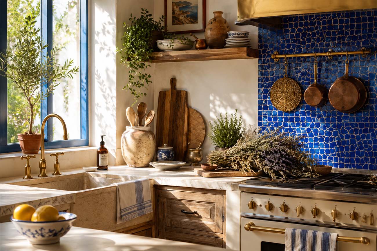
Kitchen: A blue backsplash adds personality and handles splashes and staining better than you’d expect; the colour hides a lot that white wouldn’t. It also works well as a visual anchor in open-plan kitchens, where the tiled wall helps define the cooking zone without needing a physical partition. Pair with brushed brass or unlacquered bronze fittings for something that feels genuinely warm rather than showroom-sterile.
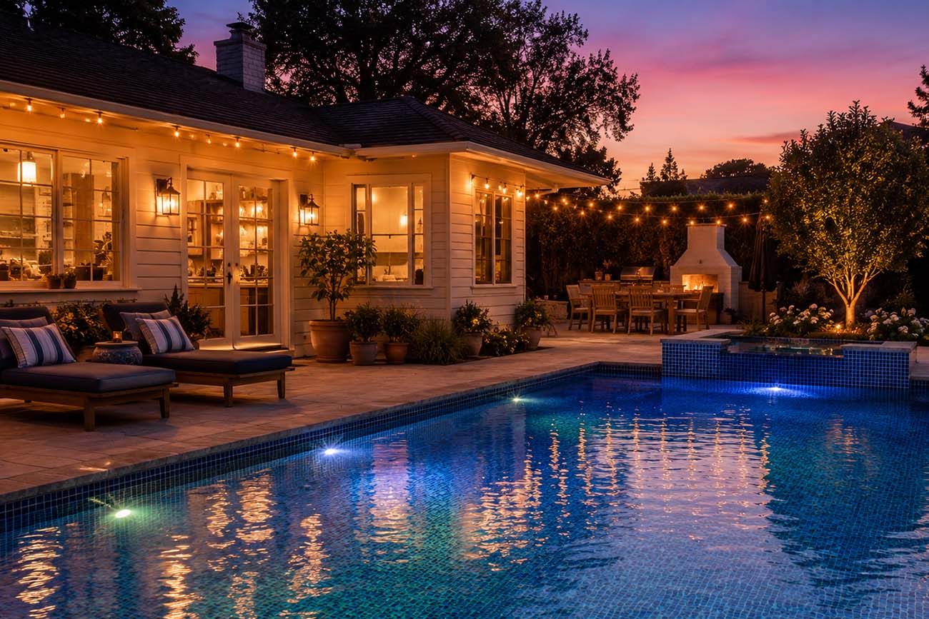
Pool surrounds: If you’re lucky enough to have a pool, blue tile is the obvious choice; and for good reason. The colour shifts beautifully with reflected water, moving from flat ceramic to something almost luminous depending on the light and the depth. Smaller mosaic tiles are traditional here; the irregular surface catches light differently across the day in a way that large-format tiles don’t.
Entryway: A run of blue tile at the entrance sets a tone from the moment you walk in. Encaustic patterned tiles work particularly well here, they’re durable enough for a high-traffic floor and visually interesting enough to make an immediate impression. Understated but effective.
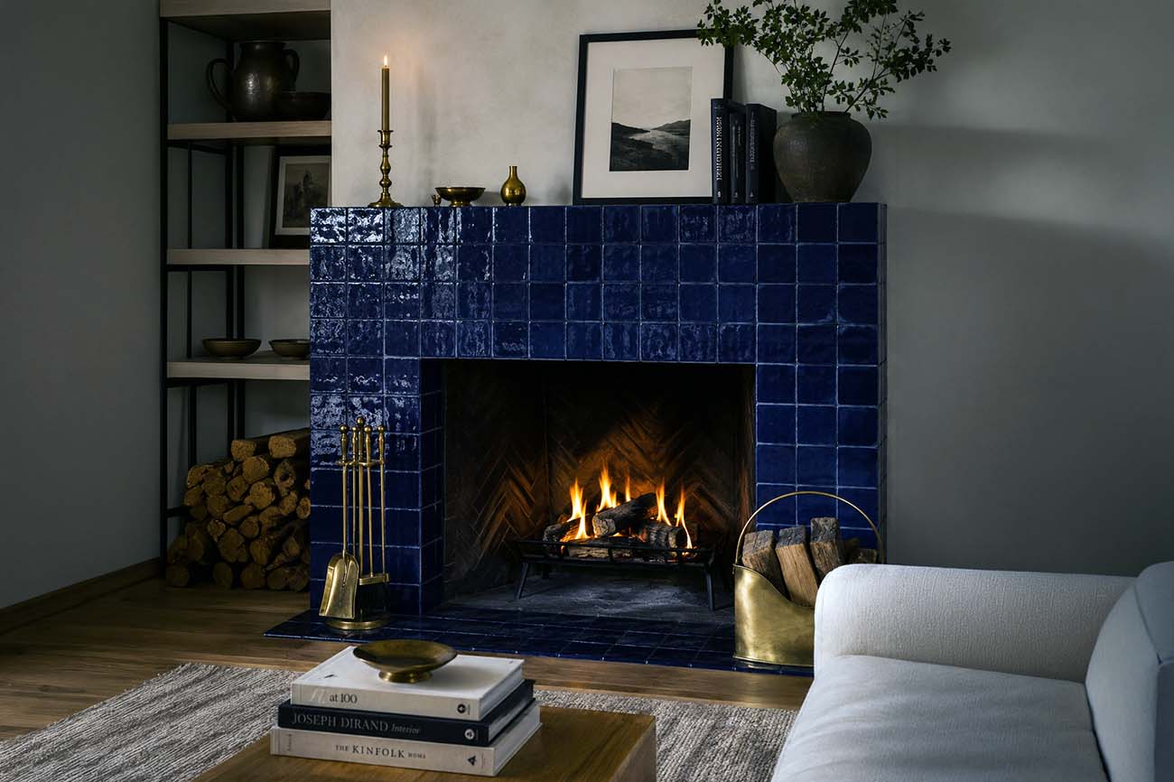
Living spaces: Less common, but worth considering. A fireplace surround in hand-glazed blue tile, or a feature section of wall in a living room, can anchor a space in a way that paint rarely does. The texture and depth of tile gives it a presence that’s hard to replicate with other materials.
Low Maintenance, Long Life
Tiles are inherently practical. Durable, easy to clean, resistant to moisture and heat. Blue, particularly in mid-tones, is more forgiving with marks than white and holds up visually over time without looking dated. One of the genuine advantages of ceramic and porcelain over almost any other surface material is longevity: properly installed and sealed, tiles last decades without significant degradation. The grout is the more vulnerable element; worth investing in an epoxy or stain-resistant grout, especially in kitchens and bathrooms, to avoid the grey-creep that plagues poorly maintained white grout lines.
It’s also worth noting that blue tiles age well in a way that more trend-driven colours don’t. A bathroom tiled in a fashionable sage green or terracotta in 2019 can already start to feel of a specific moment. A well-chosen blue doesn’t have that problem. It’s one of those materials that tends to improve with age rather than just endure it.
Getting It Right
Bring samples home, this is non-negotiable. Test them in morning light and evening light, against your grout options, next to the cabinets or walls they’ll sit beside. Tile showrooms are deceptive: the same tile reads very differently in a bright shop than in a real room with its own particular light, proportions, and existing materials. Trust what you see at home, not what you saw on the shelf.
Think about scale. A large-format tile in a small bathroom can feel oppressive; a tiny mosaic in a big kitchen can look fussy. As a general rule, the tile size should feel proportionate to the surface it’s covering; but rules in interiors are made to be broken once you understand why they exist.
Finally, don’t underestimate installation. Even the best tile looks bad if it’s been laid badly. Uneven grout lines, poor alignment, tiles that don’t sit flush; these things are immediately visible and difficult to fix without relaying. If you’re not confident doing it yourself, it’s worth paying for a skilled tiler. The material cost of good tiles is wasted on a substandard installation.
Final Thoughts
Blue tiles aren’t a trend, they’re a material with genuine staying power. Whether you’re retiling a whole bathroom, adding a backsplash, or thinking about a pool surround, the colour rewards a bit of thought. Get the shade, finish, and scale right and you’ll have something that still looks good in ten years. And probably in twenty. That’s a harder thing to say about most interior decisions.


