
You’ll likely come away from Andy Rementer’s work feeling better than you did before the encounter, but that’s not all there is to it. Featured in The New York Times, Apartamento Magazine, the New Yorker, MTV and numerous other high-end places, its playfulness belies depths that are there if you’re inclined to search them out. Via email, I ask him about that contrast and about the darker edge that seems to haunt much of his art.
Ship of Fools. Ink and watercolour on board
‘It’s fairly simple,’ he says. ‘I respond to art that’s aesthetically pleasing, but equally without depth it can leave you just feeling empty. So I think there’s a bittersweet quality to the work that I cultivate on purpose, so that it’s not just bright colours and quirky figures. I’m trying to communicate something more than that — it’s always about actual visual communication of feeling.’
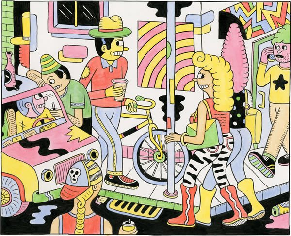
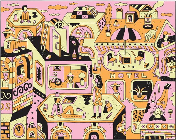
So not just eye-candy, then, though it certainly works just fine on that level. Meet Me Later, a recent show from New York City, illustrates perfectly the balance. Quirky and bright many of the pieces indeed are, but there’s something about the figures’ eyes — they’re often downcast, often looking mysteriously away — that suggests a melancholy, as does the deferred meeting of the title.
Does he think it’s something in that combination of fun and sadness that makes him such a sought-after collaborator on his various commercial projects (with companies including groovy cosmetics brand Kiehl’s)?
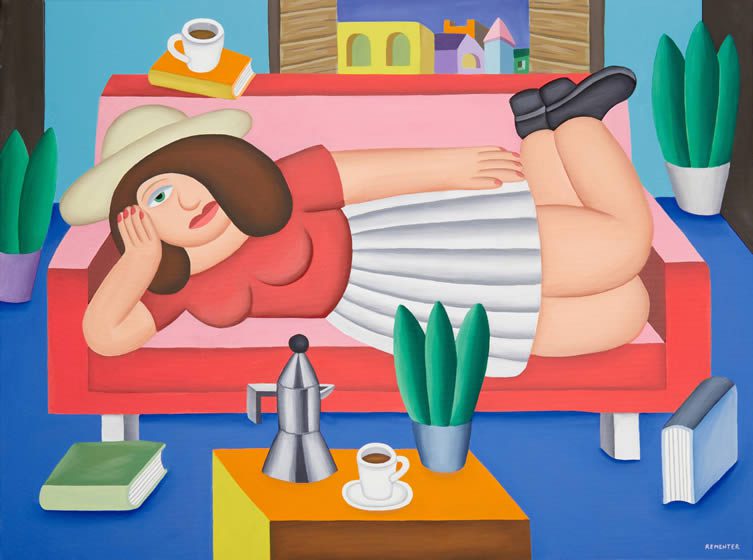
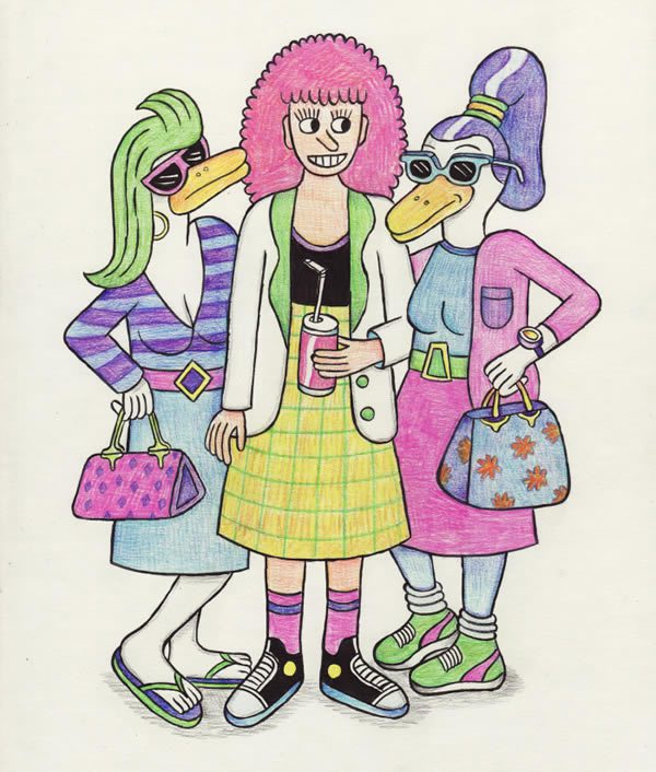
From the Meet Me Later series
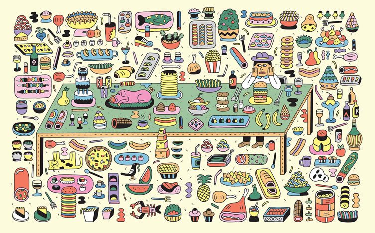
Smörgåsbord (illustration for Lucky Peach magazine)
‘Maybe. Certainly, I’m lucky in that in the case of the commercial work I’m approached because the companies like what I do. That means I don’t have to compromise my approach: they’ve come to me, so it would defeat the point to try to change what I do. It’s just a matter of finding where my world meets theirs.’
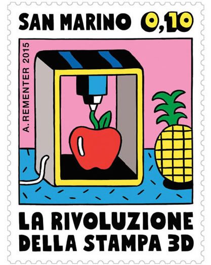
From a series of stamps about 3D printing for the Republic of San Marino
It’s also work that lends itself unusually well to a surprising range of media. Take the People Blocks projects he’s worked on with Case Studyo: angular and colourful people-components that can be combined into various figures, they’re like Russian dolls in a world where Cubism developed as a form of street art and didn’t take itself too seriously.
There’s also a Lazy Oaf tee-shirt series, an award-winning set of stamps commissioned by the Republic of San Marino and cover illustrations for Juxtapoz Magazine. Did he always plan to have such an eclectic practice?
‘I never had any kind of plan for this stuff: I just wanted to pursue my creative endeavours, and these things simply seem to come along! But I did work in a lot of different forms in the process of finding my voice, from zines to commissioned work to other pieces. So I guess that’s part of the reason: just organic exploration and development.’
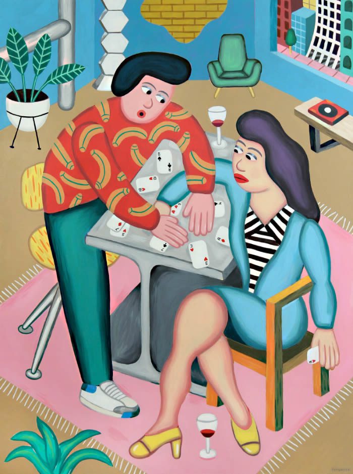
Divano Diva (from The Age of Innocence series). Oil on canvas
Ink and watercolour drawings for solo show, Together, at Commune Gallery in Tokyo
Coloured pencil ‘fashion’ drawing
It’s obviously resulted in a very distinctive, recognisable style. Does he see that changing?
‘Weirdly, I actually see my work narrowing in scope, but in a good and creative way. It’s a process of stripping away extraneous elements and finding the style inside by a process of refinement. Even though it’s me I actually find it a very interesting process to observe!’
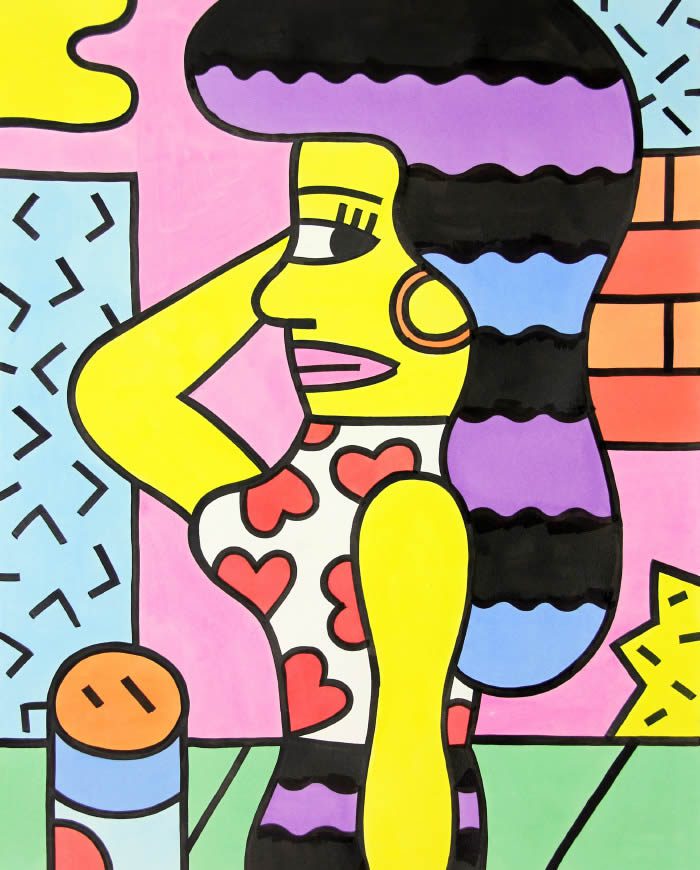
Many of the pieces from Ink Paintings, in particular, seem to combine a folk art feel, modern design, some Picasso-esque elements and vibrant pop-art. What does he see as the main cultural touchstones of his work?
‘Outsider art — I think that’s the common thread, and something I’ve always been drawn to. Other than that it’s hard to say, as I’m inspired by so much different art that I encounter and things around me in general. Certainly, I’m always trying to tell a story and to bring out characters, and that’s where the particular feeling of each piece comes from, whichever media it happens to be in.’
Ink painting on paper
From a solo show in Seoul, Korea
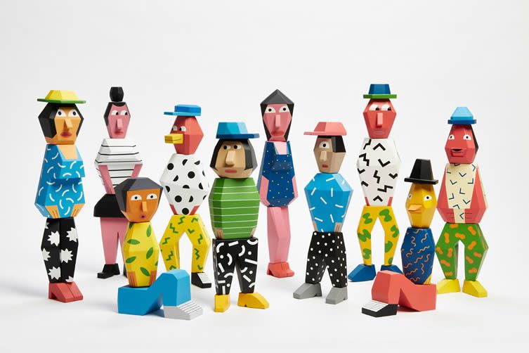
People Blocks: a limited edition artist sculpture series. Designed by Andy Rementer. Produced by Case Studyo
Rooftops screenprint
So there’s no particular period or movement that he identifies with above all others?
‘Well, there are always shades of pop-culture from various periods, which can be era-specific I guess, but I think it’s important for my work to feel timeless; the feeling of being out of time, not tied to a particular place or era, gives it a more universal quality, and more longevity.’
Based in Philadelphia (he likes it because, while close to New York, it’s also off the radar; ‘there’s enough Brooklyn on the internet,’ goes the very sound reasoning), Rementer is constantly on the road between there, London, Tokyo, Milan and wherever else the work takes him. That geographical restlessness is reflected in the stylistic and chronological restlessness in the work itself, as he’s made clear; luckily, though, one doesn’t have to pin something down to a single definition to appreciate it. Just enjoy Rementer’s work in all its restless glory.

Diner (from The Age of Innocence series). Oil on canvas
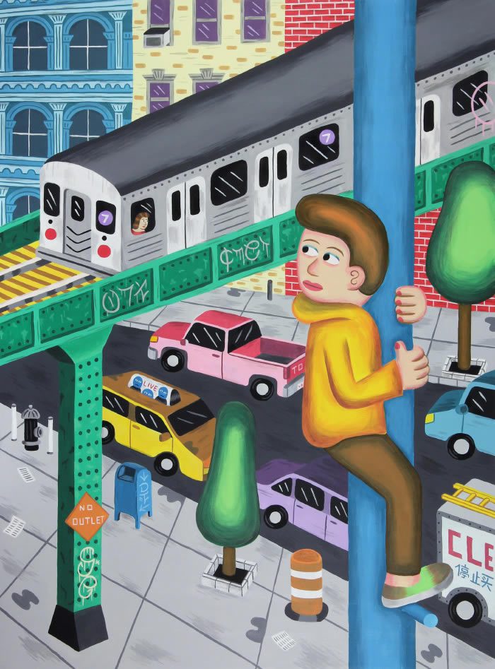
7 Train (from the I Wish I Knew series)

Andy Rementer in his studio. Photo, Ryan Greenberg


