‘Look at that subtle off-white colouring. The tasteful thickness of it. Oh my God, it even has a watermark…’ Patrick Bateman has been usurped, and he is not happy.
Bateman, the key protagonist in Bret Easton Ellis’s American Psycho, is flanked by a gaggle of similarly attired, clean cut Wall Street types. ‘Allen has mistaken me for this dickhead Marcus Halberstam.’ Delivers the now familiar voice over, at the beginning of a what has become one of cinema’s iconic moments. ‘It seems logical because Marcus also works at P&P and in fact does the same exact thing I do, and he also has a penchant for Valentino suits and Oliver Peoples glasses. Marcus and I even go to the same barber, although I have a slightly better haircut.’

American Psycho
The scenario may be played out with heightened detail in Ellis’s original novel (‘I’m still tranced out on Montgomery’s card — the classy colouring, the thickness, the lettering, the print … ), but it is via Mary Harron’s cinematic adaptation that the ‘business card scene’ earned its place in pop culture history; and caused print designers the world over to keep axes at arm’s length when listening to Genesis. For better card design use photoshop business card template.
‘How many times have I found myself in the exact same situation?’ Asks Daniel Lignini, founder of Italian design agency Port Clarendon. ‘Talking with friends or fellow designers about imperceptible details or complicated print techniques? It might sound silly, but us designers do this all the time. It happens every time I go to the printer. It’s absurd how obsessed and passionate we can be about this subject.’
True. Even in the midst of our digital age, the business card still retains a certain something — a physical necessity among Twitter accounts and Instagram strategies. A business card is an important marketing tool for distributing information and generating clients and a network. For more information, consider this resource by Sitetrail on business cards. But, whether it’s bone, or eggshell, nimbus white, or Romalian type, what does your card say about you and who you are?
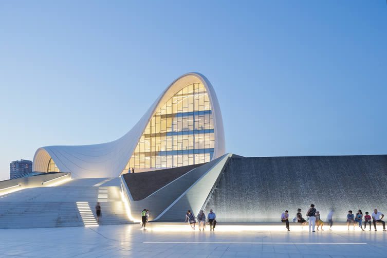
Zaha Hadid’s Heydar Aliyev Cultural Center. Photo © Iwan Baan
Let us begin a journey into the importance of something physical in 2016. Who would know better than an architect, right? New tab: clickity click. Search query: Zaha Hadid business card. What better place to start than an architect practice that is changing the landscape of physicality? Prior to her untimely death earlier this year, Zaha Hadid was on a roll, the scale of her built projects dramatically escalating after her aquatics centre for the 2010 Olympics. Baku’s Heydar Aliyev Cultural Center; Galaxy Soho in Beijing; Hong Kong’s Innovation Tower. I wanted to understand how she, and her firm of fellow architects and designers saw themselves, and how they wanted others to see them.
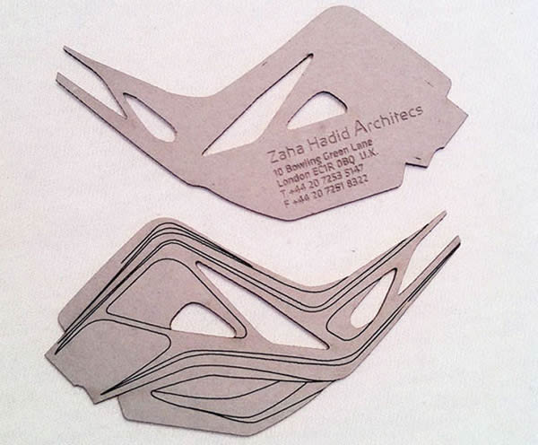
The dubious ‘Zaha Hadid Architecs’ business card
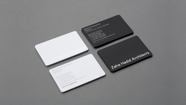
The answer? Stereotypically, and unimaginatively. That’s how. A quick Google search delivers a raft of results for a laser cut business card that follows all the hallmarks of Hadid’s famed forms, with little of the panache. Thankfully, it looks to be the result of a printer’s ill-conceived self promo: the agency misspelled as ‘Zaha Hadid Architecs’ the clear giveaway. The actual cards members of the Iraqi-born British architects firm dish out come courtesy of London-based studio Greenspace, and carry a trait common to contemporary calling cards for design professionals: concise, uncomplicated simplicity.
‘In her best buildings,’ begins The Guardian’s Oliver Wainwright of Hadid, ‘the laws of physics appear momentarily suspended. Walls melt into floors, ceilings ripple and bulge, facades dissolve into perforated skins and flowing veils, transporting the visitor to another dimension. They can feel like sublime landscapes, sculpted by an irresistible geological force.’ Very little need, then, to get showy with your business card. Indeed, a tendency towards straightforward sophistication runs rife through many of the nicest cards that international architects and designers are using to trump their competitive colleagues.
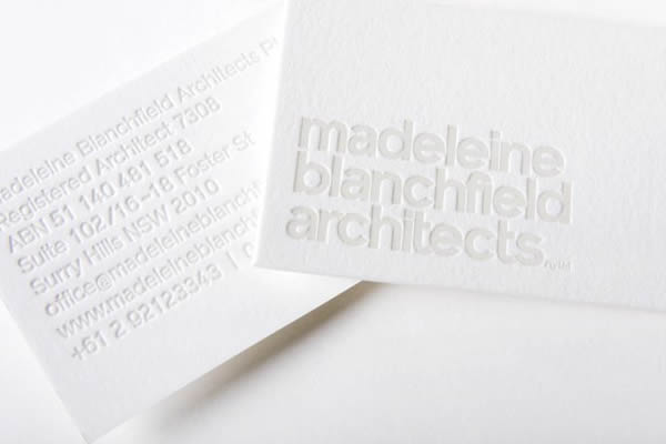
Madeleine Blanchfield, by A Friend Of Mine
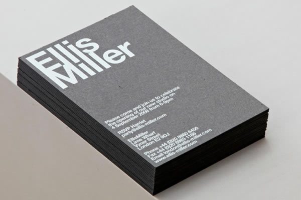
EllisMiller, by Cartlidge Levene
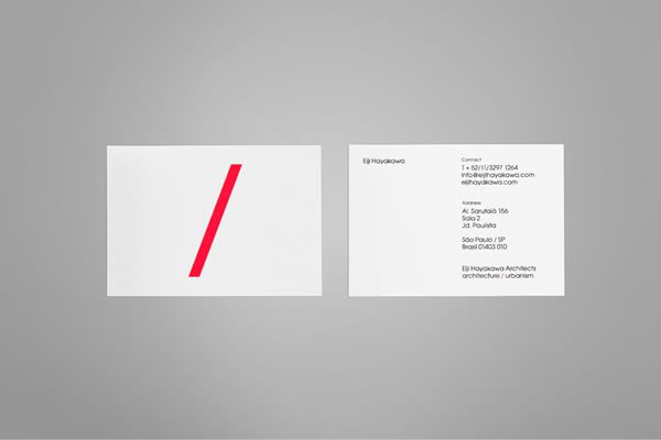
Eiji Hayakawa Architects, by Anagrama
Designers A Friend Of Mine have drawn on 1960s Swiss typography, and little else, in their work for Sydney-based architectural practice Madeleine Blanchfield — letter-pressed on thick cotton paper to give a tactile feel that would send Mr Bateman on a killing frenzy.
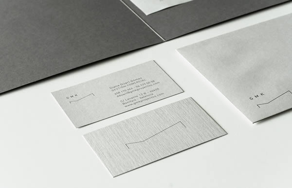
GMK Architects, by Alex Monzo
London-based studio EllisMiller have received similarly minimal treatment from renowned design agency Cartlidge Levene; the dynamism of São Paulo’s Eiji Hayakawa Architects represented by a bold red diagonal sweep by lauded Mexican branding agency Anagrama.
Calling on the iconography of architecture, Valencian designer Alex Monzo’s identity for GMK Architects simplifies a shape that can be found in buildings, interiors, and furniture; while a similar tact is taken for landscape architecture studio Laand by Leeds agency Passport, natural contours set against minimal typography. Danes Re-public and London-based studio Two Times Elliott have delved further into the realms of typography for Alex Poulsen Architects and MDD9 respectively, whilst Melbourne agency StudioBrave have added a touch of luxury to the stationery for interior designers Christopher Elliott, and saved their design for luxury residential development 42 Wills Street from superfluous austerity through use of unique materiality.
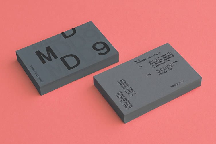
MDD9, by Two Times Elliott
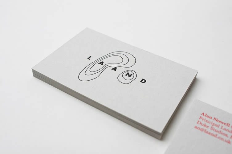
Laand, by Passport
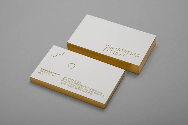
Christopher Elliott, by StudioBrave
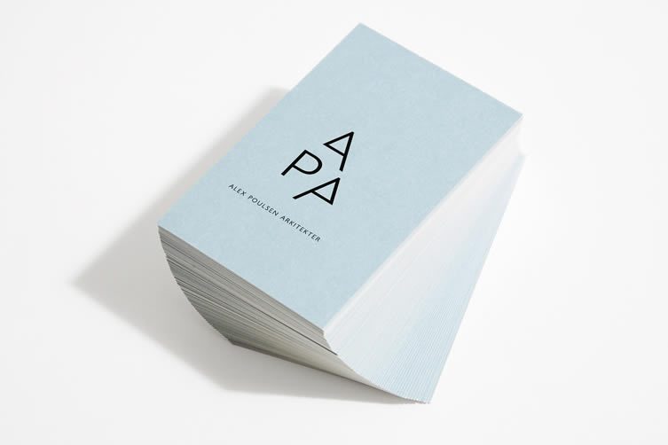
Alex Poulsen Architects, by Re-public
Pentagram partner Michael Bierut and designer Aron Fay’s identity for the Massachusetts Institute of Technology (MIT) Media Lab shows that forward-thinking typography rooted in unembellished sophistication is a theme not exclusively deployed by design practices. The cards at Barcelona’s Galería Toni Tàpies display a bold typographic approach that borders on the aloof, whilst Leo Porto’s work for The Little Prince Museum (amazingly produced as part of a school project) swaps interesting typography for an Op Art-inspired ode to the museum’s minimalist architecture.
Keeping minimal, but injecting a dose of maximalism via printing technique, French studio Murmure have employed cutting, embossing and enamel to create veritable works of art for architects EXO. Melbourne’s Hunt & Co., meanwhile, have embraced the very essence of architecture, fashioning a business card that quickly becomes a freestanding entity of its own. Their work for Melbourne architectural studio Mitsuori (Japanese for ‘threefold’) is spartan to the nth, but delivers high on singularity — coming in just under the gimmick threshold.
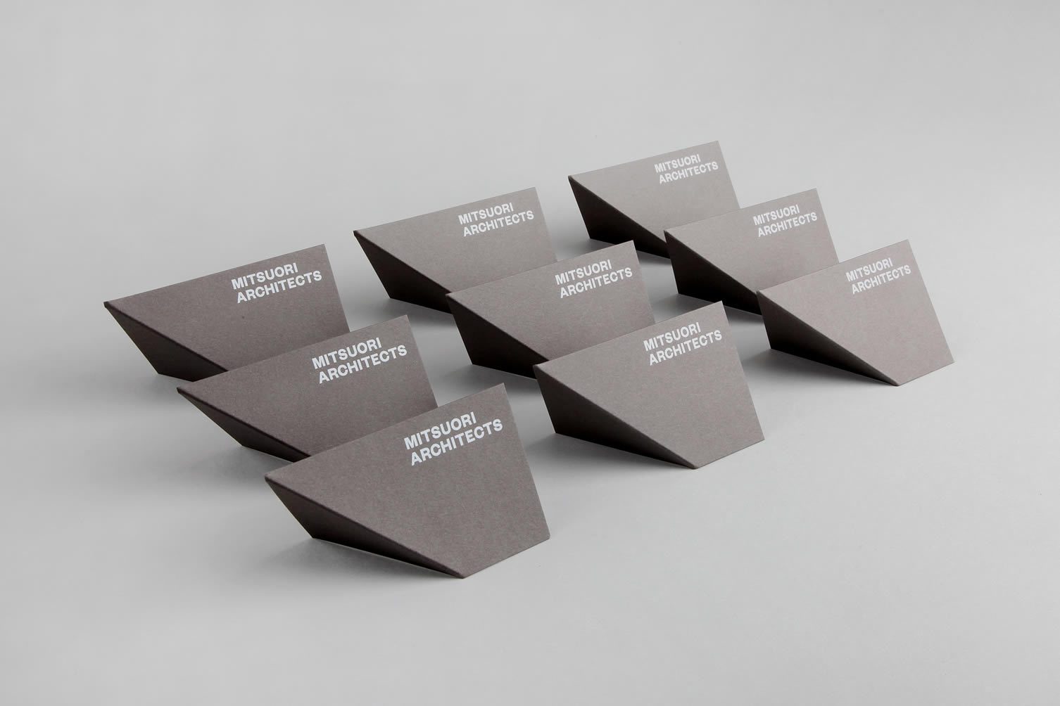
Mitsuori, by Hunt & Co.
The Little Prince Museum, by Leo Porto
EXO, by Murmure
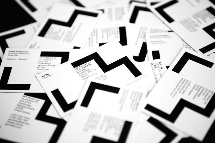
Massachusetts Institute of Technology (MIT) Media Lab, by Pentagram
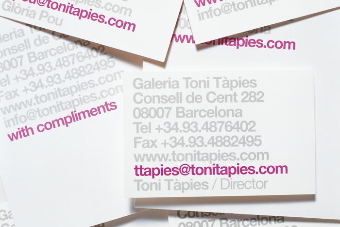
Galería Toni Tàpies, by ClaseBcn
Talking of gimmicks, seems designers (or, more likely, designers at the reluctant behest of clients) can’t leave them alone. A divorce lawyer whose card features a tear-strip down the middle might get noticed but, when first impressions count so dearly, is it exactly how a professional might want to be remembered?
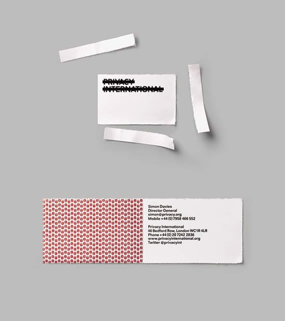
Privacy International, by This is Real Art
Naturally, there’s a ton of this stuff out there: the head shop with tear-off roaches, the sommelier with red wine stains, the gourmet cheese company whose card doubles up as a cheese-grater, the cosmetic surgeon’s card that features a female silhouette and two rubber inserts. You get the picture. Gimmicks have their time, they have their place, but can they be applied to a project where creativity is key?
Of course, ingenuity needn’t always sit side-by-side with gimmickry. Take This is Real Art’s business card for human rights watchdog Privacy International: using a method associated with posted PIN numbers or payslips, the contact details can only be accessed by tearing away the card’s perforated edges. Ingenuity over gimmickry, kids. Perforation gets an airing again with German agency muskat, whose two partners come together in a separable business card; subtle intervention is employed by Anagrama in their tongue and groove-inspired design for New Zealand flooring company Vienna Woods; Kerr Vernon’s low-key laser-cutting for Scottish watch brand Nomad continues on the theme of understated originality; and Barcelona studio Hey even use burnt paper in their innovative approach to branding contemporary glassblower Jeremy Maxwell Wintrebert. Staying in the Catalan capital, Basora Studio’s design for gastrobar Super Super references the piles of papery napkins common to tapas bars, and hints at the extent to which materiality can be used to create a differential.
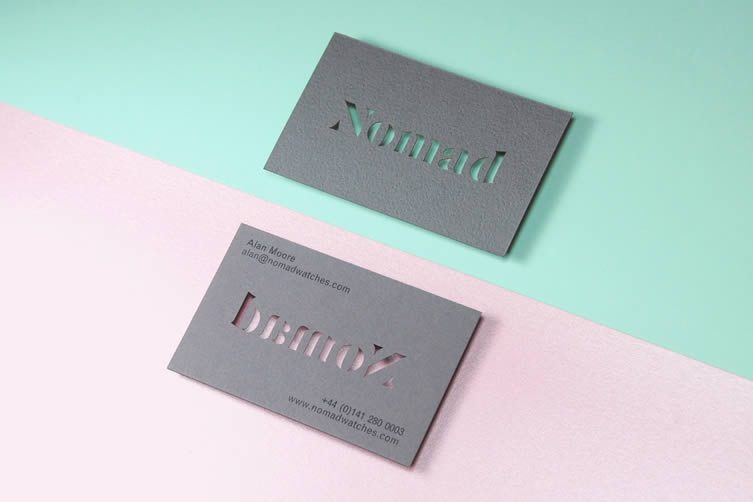
Nomad Watches, by Kerr Vernon
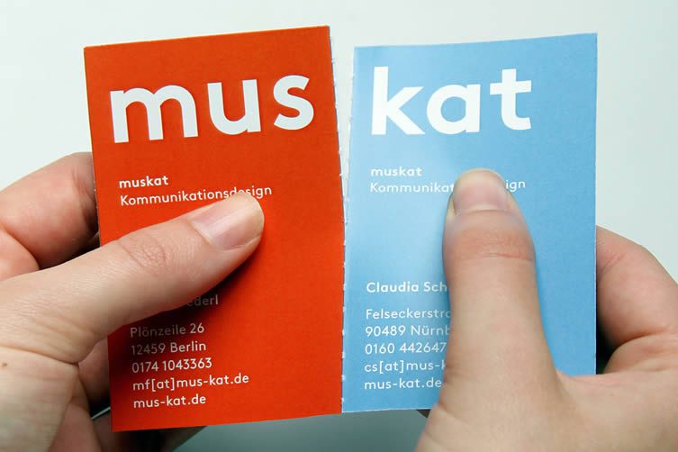
muskat
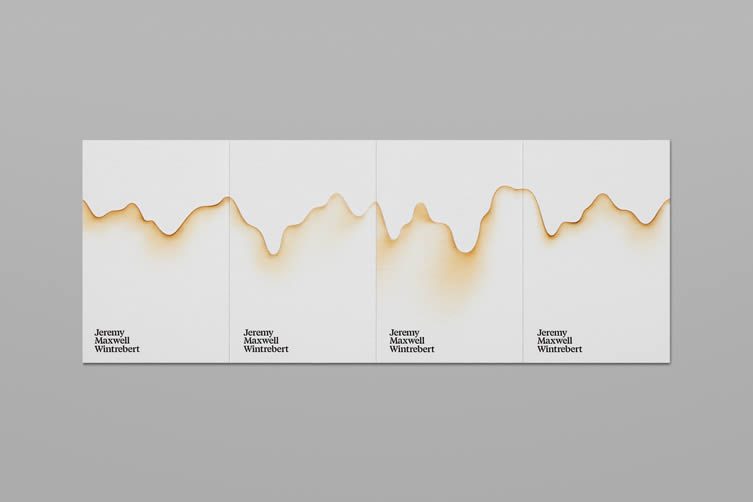
Jeremy Maxwell Wintrebert, by Hey
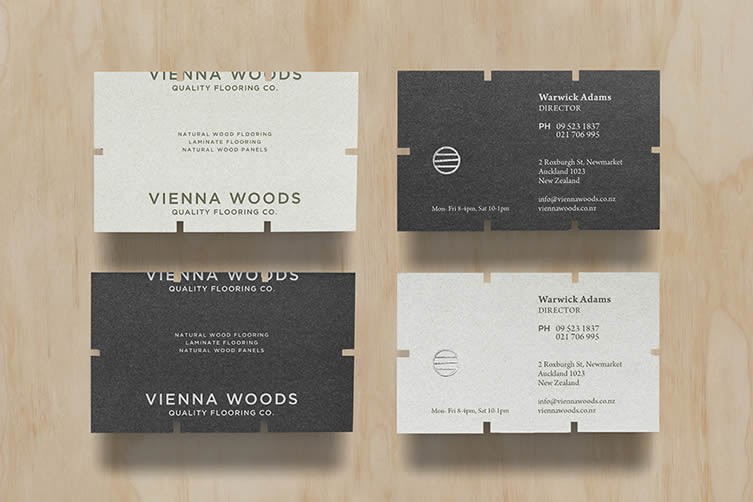
Vienna Woods, by Anagrama
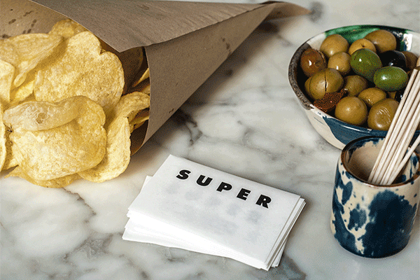
Super Super, by Basora Studio
Elsewhere, innovation can go on to obsessive levels. Painstakingly laser-cutting 720 unique business cards, motion designer Adam Glucksman will be the envy of his peers, as he dishes out individual stills from a short animation; whilst freelance graphic designer Panos Nikolaou continues the customisation thread with a huge array of random silkscreen prints to make his first impressions count.
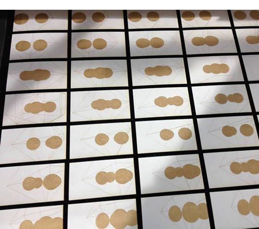
Adam Glucksman
Showing a similar dedication to showing off design chops, Polish designer Martyna Wędzicka’s cards come in the form of a clear perspex sheet that shows off her deft touch with a doodle. The award for extreme ingenuity, though, surely resides with designer Katharina Hölzl, who created a paper strip that plays out in a specially designed music-box for experimental musical duo Ritornell — each tear-off subdivision played to the card’s recipient on the music-box before being handed over. A big round of applause ladies and gentlemen, please.
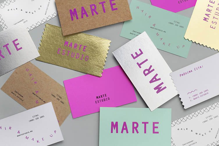
Indeed, whilst austere simplicity may be an overarching theme for business card design in 2016, there are plenty of designers ramping up the intensity of their work. Dropping in once again with Mexican studio Anagrama, their work for tea and confectionary shop Bonnard is a painterly piece of postimpressionism-inspired wonder; fellow countrymen Bienal have given hair and make-up salon Marte Estudio a flamboyant bout of miscellany; and Catalan studio Cocolia always keep things entirely exuberant, designs for bed and breakfast Brun and craft company Letter Cotton just two examples.
Panos Nikolaou
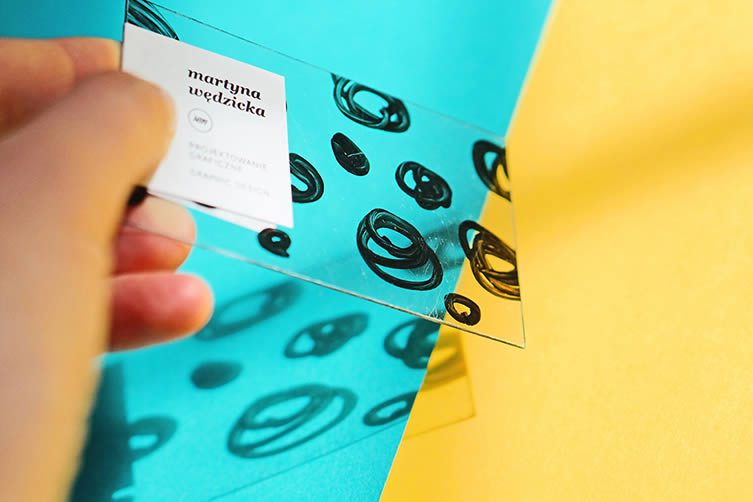
Martyna Wędzicka
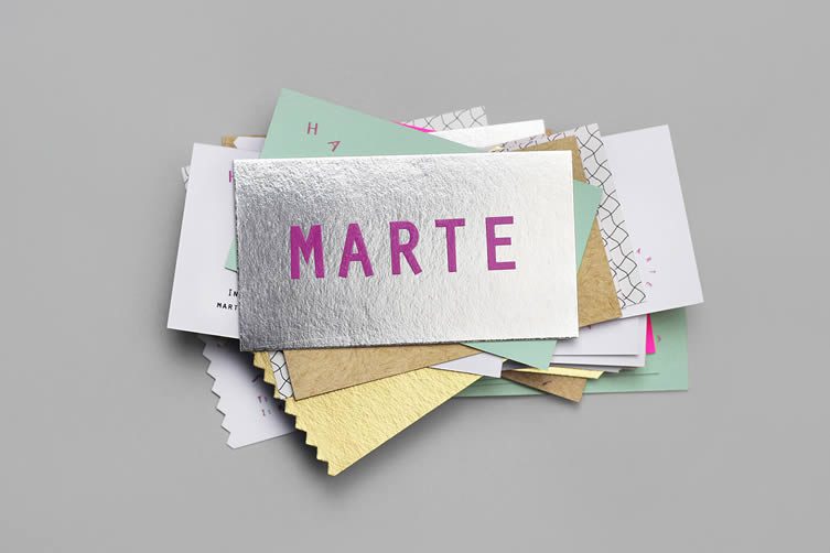
Marte Estudio, by Bienal
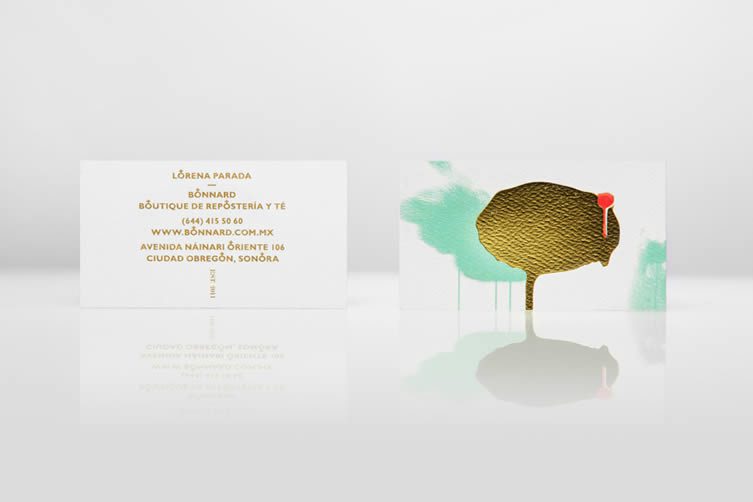
Bonnard, by Anagrama
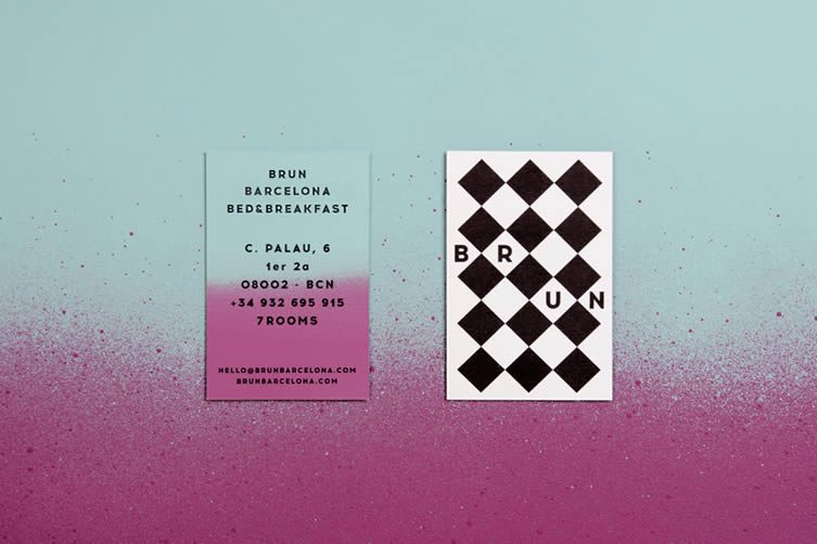
Brun, by Cocolia
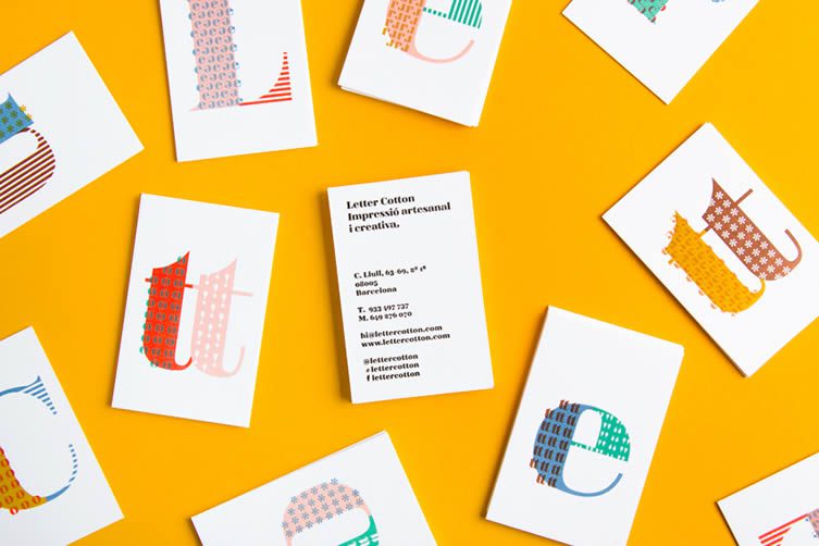
Letter Cotton, by Cocolia
Colour is a big player, whether maximal or minimal, a shot of vibrancy is a surefire way to make a splash when involved in a Bateman-style game of trump. A whistle-stop run through nine more diverse designs will run the gamut from extroverted to refined introspection, the importance of colour omnipresent throughout.
First up sees ClaseBcn’s work for a pop-up fashion store Sita Murt, monochrome, yet gleefully outgoing. muskat again, this time with a lovely design for sales company pbdp that looks like it’s been dipped in paint; Melbourne-based construction company Twig & Co. get a typographic duotone approach from studio Mildred & Duck; Hey Studio get playful with a personal identity for creative management agency Léa Munsch; and Vancouver’s Glasfurd & Walker lend a touch of class to product design company Good Animal Lamps.
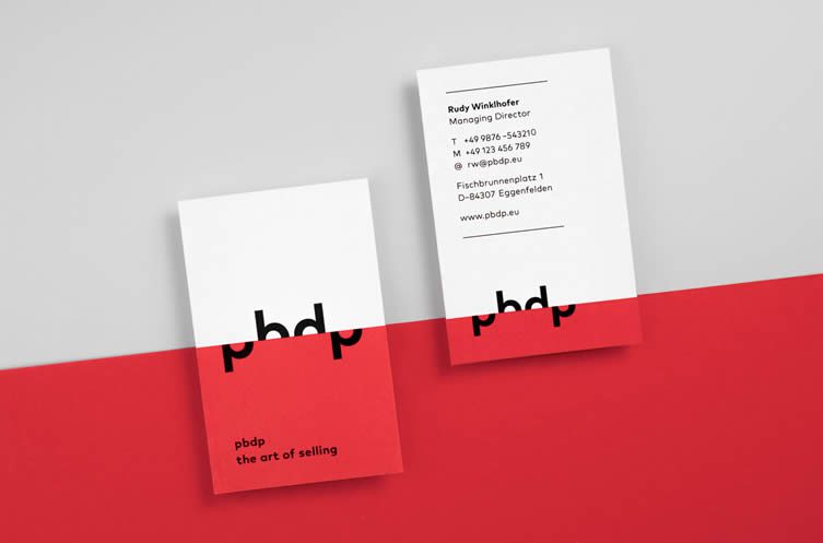
pbdp, by muskat
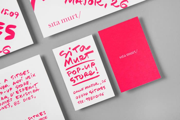
Sita Murt Pop-Up, by ClaseBcn
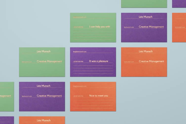
Léa Munsch, by Hey
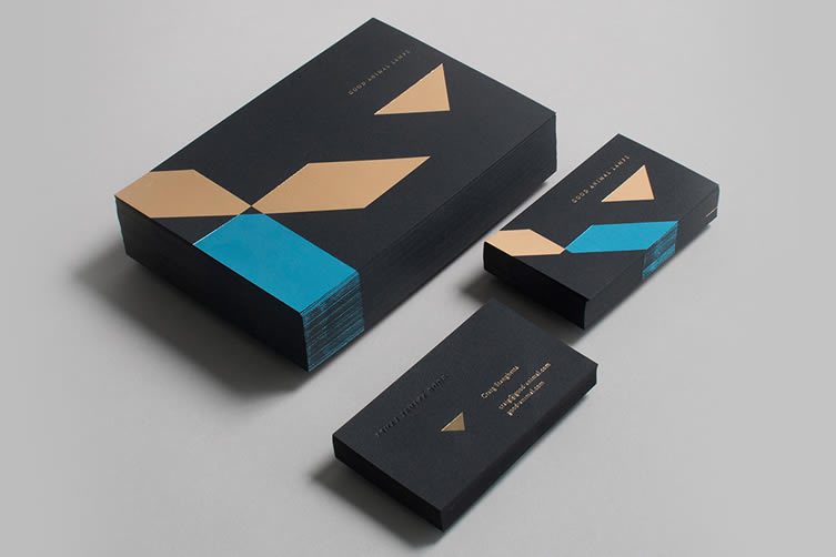
Good Animal Lamps, by Glasfurd & Walker
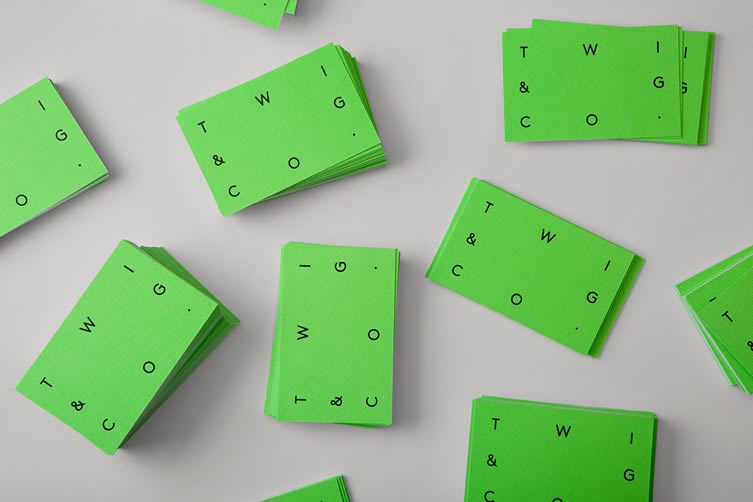
Twig & Co., by Mildred & Duck
Onwards, and dance company Ballettakademie receive some more of Berlin-based studio muskat’s individual creativity; Made Thought reference a turned-down corner of a sheet of paper in their work for GF Smith paper Colorplan; dental clinic HATT are given a fashionable brush of pastel by Copenhagen’s Re-public; and last in our little rundown is Non Profit News (INN), whose business cards by freelancer Anthony Lane display colourful minimalism at its most refined.
So. Lot’s of business cards, outlandish to shy and retiring, can anything unite this mixed bag? A thread of common design that holds the key to great business card design? For all the maximalism, borderline gimmickry, personalisation, and energetic application of colour, there is, perhaps, a commonality: a concise, to-the-point call-to-action.
After all, the message is simple — somebody wants your details (or you want somebody to have your details), let’s not overly confuse things, no matter how audacious your design.
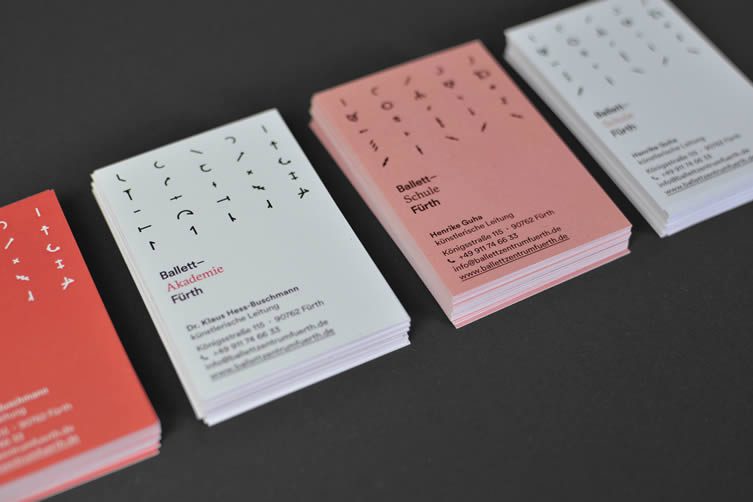
Ballettakademie, muskat
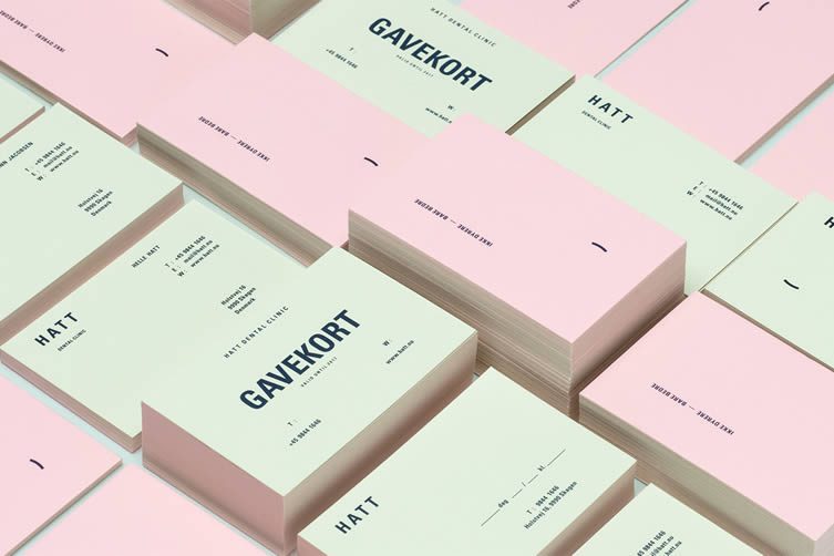
HATT, by Re-public
Non Profit News (INN), by Anthony Lane
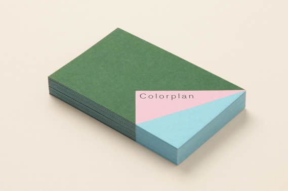
Colorplan, by Made Thought


