Choices around colour in interior design are one of the most important aspects when designing a space, with different colours having the ability to completely transform the appearance, atmosphere and feel of a room. Although interior design colour schemes have changed throughout the years, from the pastel shades of the ’50s and the browns and oranges of the ’70s, the modern choices we experiment with in our homes today still follow the same rules of colour psychology.
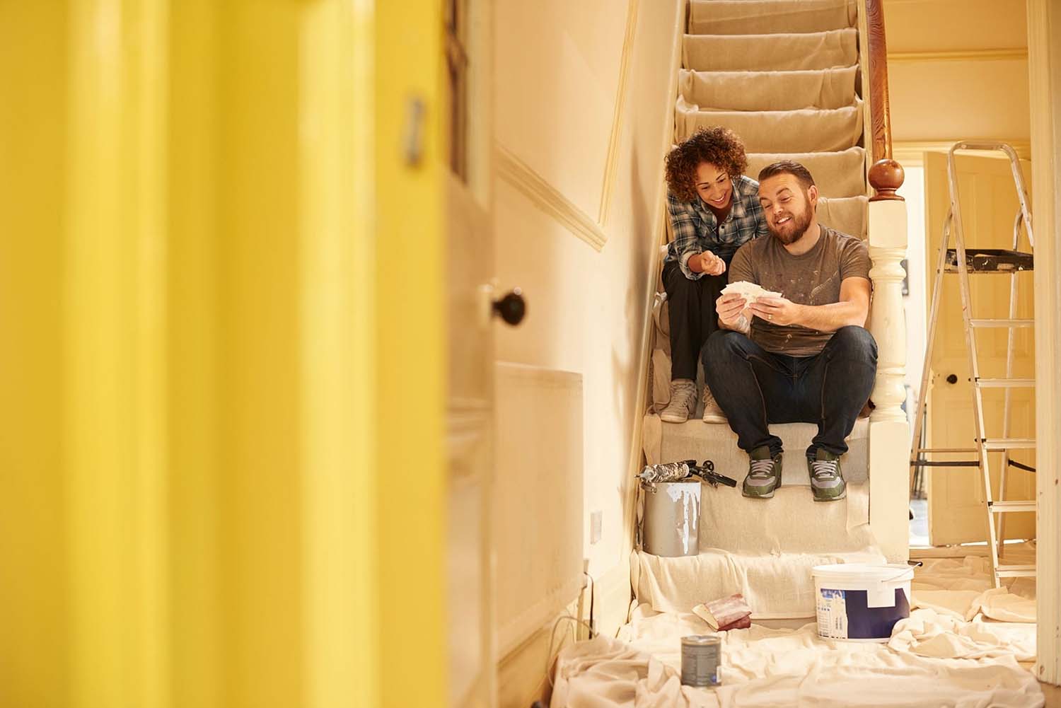
If you are planning on revamping your interior decor, this article will provide some insight into the use of colour, its impact, and how to use colours within your interior design.
Using colour in interior design
Colour choices are such an important part of a room’s overall design, with different colours being able to completely transform how a room both looks and feels. This is why it is always recommended to think carefully about what style and feel you are looking to create. For example, do you want to add a sense of calm or make the room feel exciting and energised?
It is important to consider the psychology of colour, often referred to as chromology, which studies how colours are perceived and the effect they have on mood, as colour psychology could help us to make excellent design choices.
Of course, your own style will influence how you choose to decorate your home and trends will naturally evolve, but by loosely following the rules of colour psychology it is possible to create the desired atmosphere. For example, warmer colours such as yellows and oranges will actually make you feel hungrier, which is why they are often used in restaurants.
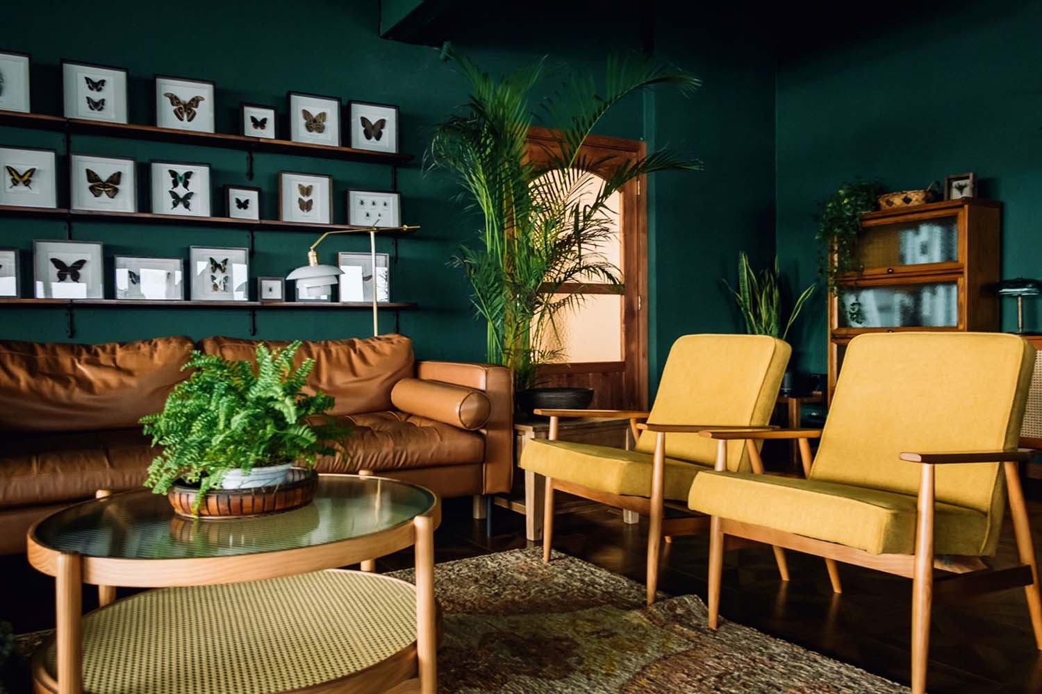
Whereas, green shades are associated with freshness and the outdoors, so they are popular within living spaces. Of course, it is also important to consider how the light fills the room, with lighter shades being ideal for south-facing rooms and warmer hues more suited to rooms that are north-facing.
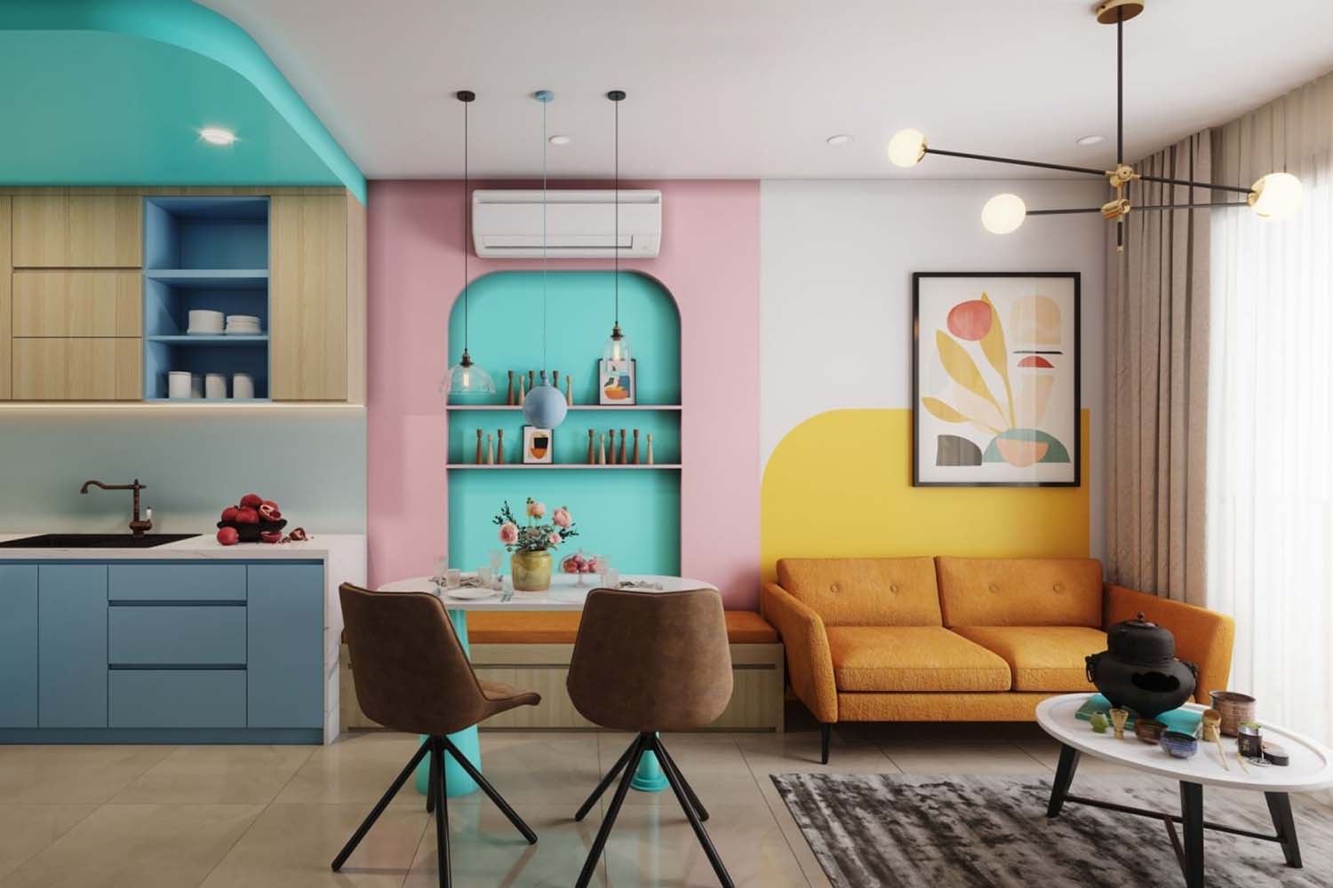
If you are nervous about choosing a single hue, colour blocking is a great way to incorporate two or more colours into a space. Depending on the colour choices, it can also add personality and vibrancy without being overwhelming.
A great example, which is a popular trend within kitchen interior design, is to use contrasting colours on the top and bottom units within a kitchen, with a mixture of bold, dark tones paired with light colours to give the room brightness. You could even transform your home with some of the most popular tile colours for 2022 to add pops of colour to your kitchen and bathrooms.
While white, grey, and black are staple colours to use for tiling your home, you could experiment with a more eye-catching look with pink and yellow which are also trendy colours too.
Embracing colour theory & the colour wheel
While colour theory is often very useful to use in graphic design, understanding the theory and the meaning of different colours can help you to understand how you can best use them in your home too. While blue provides a sense of peace and tranquillity, yellow can signify happiness, and purple can express luxury.
The colour wheel is a great place to start when comparing interior design colour schemes, although with so many potential combinations, choosing colours can feel overwhelming.
A great place to start is with the colour blue, which is often described as the world’s favourite colour. As blue is naturally a calming colour, it is well suited to bedrooms, offices, living spaces and within kitchen interior design. It is also important to consider the shade you choose too when revamping your living space as it can make a big difference. The lighter blue shades will make a room feel brighter and more open, whereas a dark blue will create a more intimate, relaxing, and cosier feel.
Of course, there is no need to commit to a single colour, as many hues can be mixed and matched to create a stunning finish. A great example is the colour black, which offers a sophisticated and bold touch whilst creating a perception of depth. The neutrality of the colour also allows black to be paired with many shades, whether you are a fan of bright, warm colours such as yellows, reds and oranges or neutral shades of cream and white.
Another example of a stunning colour which is often underrated is pink, which can create a sense of calm and lift our moods. It is often reserved for the bedrooms of young girls, but a great place to use this colour is within interior bathroom design, as it naturally evokes feelings of beauty and comfort, and with both light shades and darker hues available, there are options available for all bathroom shapes and sizes.


