Apparently some Americans are set to take part in some vote today – god, I wish the media would have kept us informed on this. Anyway, in another classic case of good versus evil, we’re all praying (in god we trust) that Mitt doesn’t get into power and instil another 4 years of world terror upon us; quite frankly we’re all still getting over Bush Junior irreparably changing the world we should ardently be trying to coexist within.
International oil baron conspiracies and too much time reading Michael Moore books aside, the vote itself – and the complexities of American politics as a whole – is often a difficult science to grasp; race and religion consistently play a key part in US elections, and now the economy enters that equation with a bang. Attempting to make sense of it all – by putting speeches, campaigns and subjectiveness to one side – Mapping America attempts to understand America’s political complexities through infographics alone.
Work from designers like Eric Fisher, Sarah Williams and MGMT (no relation to the band) are on show at this topical KK Outlet exhibition that opens tonight (for a special election night event) and runs ’til 24th November. If you’re looking for a creative break from the constant rolling news updates – this is for you.
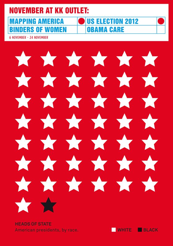
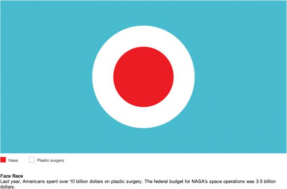
MGMT
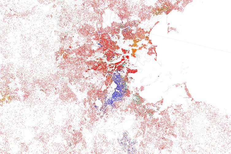
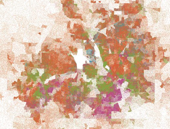
Eric Fisher, L.A. Race Map
White is red, Black blue, Hispanic orange, and Asian is green
One dot is equal to 25 people.
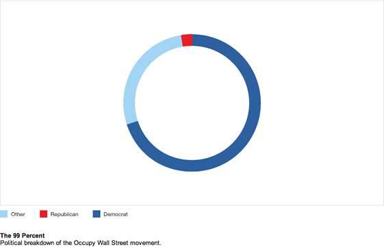
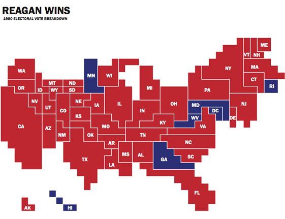
MGMT
Sarah Williams
Kirk Goldsberry
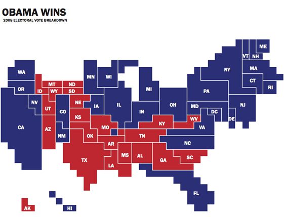
Sarah Williams
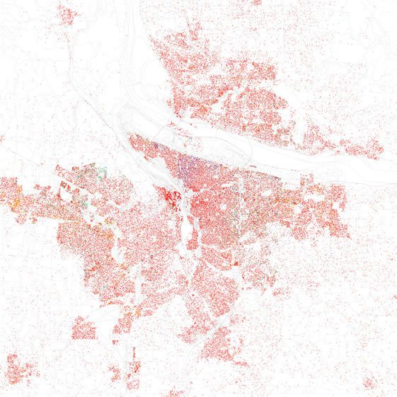
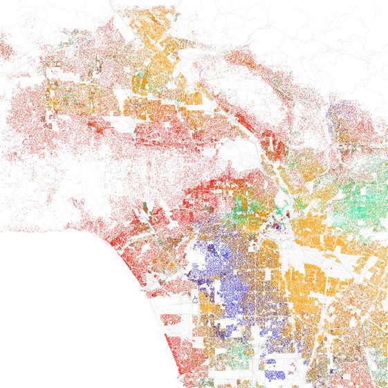
Eric Fisher, Portland Race Map
White is red, Black blue, Hispanic orange, and Asian is green
One dot is equal to 25 people.