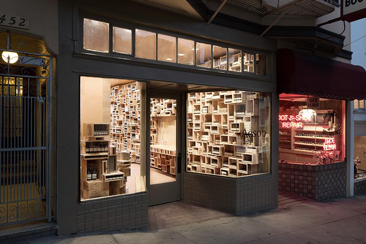
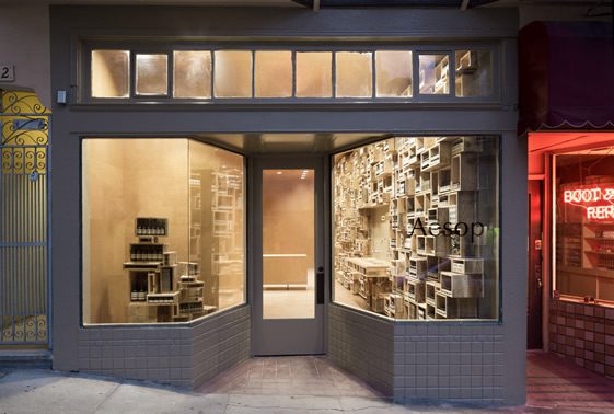
Aesop has got previous for non-conformity in the design of its retail premises. In fact the body products company has been stepping out of line from its High Street neighbours since its inception in Melbourne in 1987. The last addition to the ever-growing chain we featured was in London’s Soho, and employed in its product displays a scatter-gun approach – the latest outlet in San Francisco’s Fillmore Street, while employing a different interior architect in NADAAA of Boston, has similar characteristics which indicate Aesop has a definite desire to stand out from the crowd.
This approach, although seemingly chaotic, does nothing to detract from the beauty of the overall aesthetic, and the apparent higgledy-piggledy stacking of rough wooden crates is actually an intricately planned, intelligent feat of design and construction. The store is a bit like Helena Bonham-Carter, and we’ll qualify that quickly before you leave; she seems like a crazy mess (sorry Helena, please don’t sue), but closer inspection reveals a bit of a knockout with the smarts to beat three chess opponents simultaneously, while learning 16-pages of dialogue. Well that’s what I think anyway, but I am on a lot of cold medicine. Please yourselves…


All photographs courtesy of Aesop


